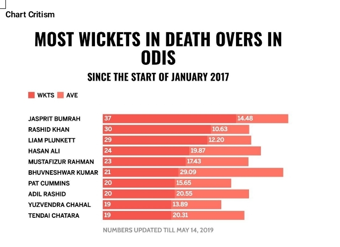
The above chart is intended to provide horizontally stacked information for participants in a cricket game. However, the information provided does not make sense to an average reader.
This is because all chart elements – title, legends, colours, gridlines, and data labels were wrongly represented. Let’s analyse these elements and identify the faults; Title: A good title should be able to communicate clearly teh message of the chart.
The heading in this case (Most Wickets in death overs in odis) is not making any sense as it failed to communicate what the chart reprents in clear English. Legend: A chart’s legend shows what kind of data is represented in the chart. It makes understanding of the chart easier.
In this case we see “WKTS” and “AVE” which does not make any sense to an average reader. Ideal thing representation could be “WICKETS” and “AVERAGE” depending on what the writer is trying to communicate. Colour:
This is a horizontal stacked chart with 2 closely identical colours. This makes the difference in the stacks not readable. For stacked chart it is better to use 2 contrasting colours like blue and red to represent WKTS and AVE respectively. Grid lines: these are lines that cross the chart plot to show axis divisions.
They help viewers of the chart see what value is represented by an unlabeled data point. The absence of gridline in this case makes it difficult to identify where specific numbers start and stop. Data Label: these are the values of the data series of the chart providing the information as numbers or percent values.
In this case the data labels were represented as numbers inside the bar chart. However, the representation is incoherent as WKTs are seen as whole numbers while AVE are represented in fractions. Best scenarion will be to include approximated figures for the AVE input.
Overall, there is a visualization problems associated to this chart. A standard bar chart should have two perpendicular lines or axes. The horizontal line is usually called the X Axis while the vertical line is called the Y axis. This chart failed to follow this rule.
My sugestion will be to use a Vertical Clustered Column chart for this representation.
Let Zebra News help your business/brand reach a wider audience. Advertise with us today! Contact Our Marketing Team; Tel: 08062622328, 07083662767. Email: zebranewsng@gmail.com


![Queen Fadojutimi Rachael Emerges 2022 Miss Ekimogun, As Mr Nigeria International, Others Act As Judges [PHOTOS]](https://zebranewsonline.com/wp-content/uploads/2022/12/IMG_20221204_205523-218x150.jpg)


![Film Maker Seunmanuel Faleye Frowns At Religious Violence In Nigeria As Deeper Truth Premieres In Lagos [Photos]](https://zebranewsonline.com/wp-content/uploads/2018/08/Seunmanuel-Faleye-Zebra-News-100x70.jpg)


